uDocz for students
The study experience of a platform with 4 million students a month: read, talk to an AI tutor, practice and review. A product that lived for years in Figma and is now being rebuilt from scratch as living code, tied to the design system.
⌐ ONGOING CASE — THE REPOSITORY MOVES EVERY WEEK; THIS IS TODAY'S SNAPSHOT
⌐ THE DEMOS ARE INTERACTIVE RECONSTRUCTIONS — THE REAL PROTOTYPE IS AT THE END OF THE CASE
From Figma to a design repository.
The product has been in production for years and its design lived in Figma: screens aged the moment they were implemented, and what was drawn drifted from what ran. The decision was to rebuild it from scratch as a navigable prototype: HTML, CSS and JS with synthetic data, no backend, in a repository where design is code that executes.
And it isn't an isolated repo: it consumes the design system as a submodule, read-only. Whatever is needed and the system doesn't have yet gets built in its own staging folder and used in prototype production. Once it proves its worth, it's promoted to the DS so the other products inherit it. B2C is the testbed for the system that holds up the whole suite, the same one from case 01.
Years of layers, and the product's rules living in people's heads.
The platform models three session states (anonymous visitor, registered and subscriber) and nine material types, from class notes to an infographic or a solutions manual. On top of that sits a role that cuts across the states: the contributor, who uploads and sells material of their own. It doesn't change what they can read; it changes what they can sell and how their authorship is credited. Every combination changes what can be read, downloaded, practiced or unlocked. Those rules existed, but they lived scattered across the code, the team's memory and old conversations.
Every redesign tripped on the same stone: nobody could answer with certainty "what happens if a free user tries this?" without going to ask the code.
I wrote the capability matrix that answers that question for every profile, on every surface: what's full, what's limited, what asks for signup, what asks for payment. The document and its mirror in the prototypes' code update together, by rule: if the matrix changes, the prototype changes in the same move.
A deliberate detail: the matrix admits the value "pending". It declares the gaps the product hasn't resolved yet, instead of pretending the map is complete.
One place, three destinations.
The logged-in app is a single shell: a global chrome and three destinations shown inside it. Switching destination reloads nothing, because they aren't different pages but places in the same site. The decision was written into an architecture decision record: a short document that fixes what was decided and why, so nobody re-litigates it from memory. Home v3 is the canonical architecture.
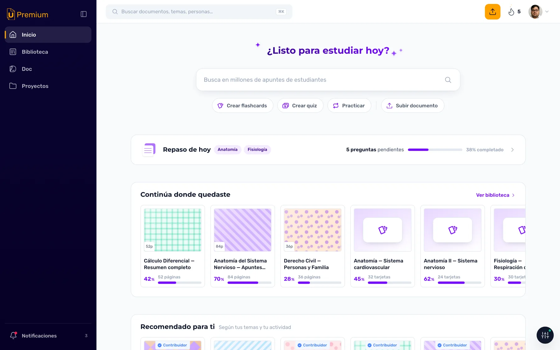
- Home is for picking things back up: what you were reading, the review due today, and the shortcuts to create material with AI. It isn't a discovery front page — it's the desk.
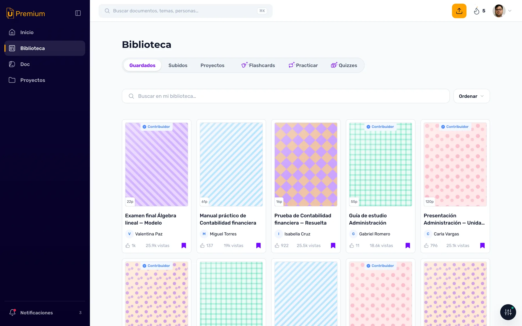
- Library is everything of your own, in six sections grouped into two families. What you saved, uploaded and organized into projects on one side; what you generated with AI (flashcards, practice, quizzes) on the other. Material that already existed vs. material you produced.
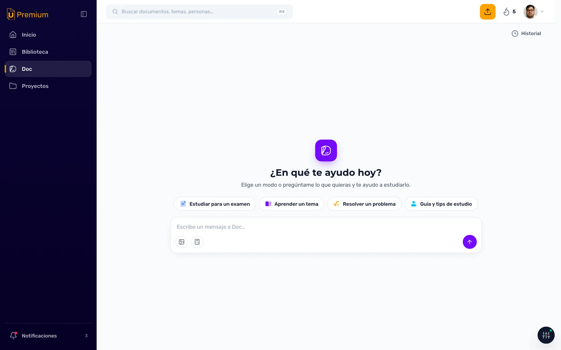
- Doc is the AI tutor, with a destination of its own: a full workspace, not a side panel. The next section belongs to it.
Doc, AI Tutor: four modes and a voice with rules.
Its hub opens with a question and four modes. Choosing one doesn't configure anything silently: the mode's name enters the thread as your own message and Doc replies by introducing itself.
- Study for an exam starts a round of exam-style questions, with hints on request and the reasoning behind every answer, right or wrong.
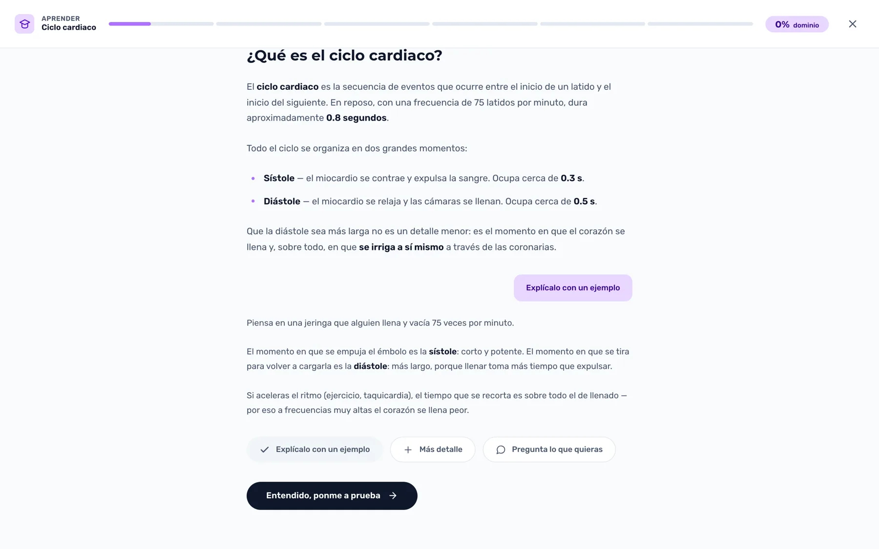
- Learn a topic generates a tailored lesson and opens it in a full-screen player: steps that go from fundamentals to mastery, with practice in between.
- Solve a problem takes the exercise apart with you (what you're given, what you're asked for, what connects them) before touching a number. The calculator in the composer is a direct shortcut to this mode.
- Study guidance and tips answers the method questions: which technique to use, how to build a habit, how to split your time across midterms.
Typing creates the chat, there's no intermediate screen: the hub disappears and your message is already in the thread. And Doc has a voice of its own, documented with concrete rules: zero emojis, no opening with a celebration ("Great!", "Perfect!"). A correct answer is acknowledged by explaining why instead of applauding. It never announces an action that doesn't arrive in the next message. The principle behind it: a friend who knows the subject, not a cheerleader.
Three ways to study on one shell.
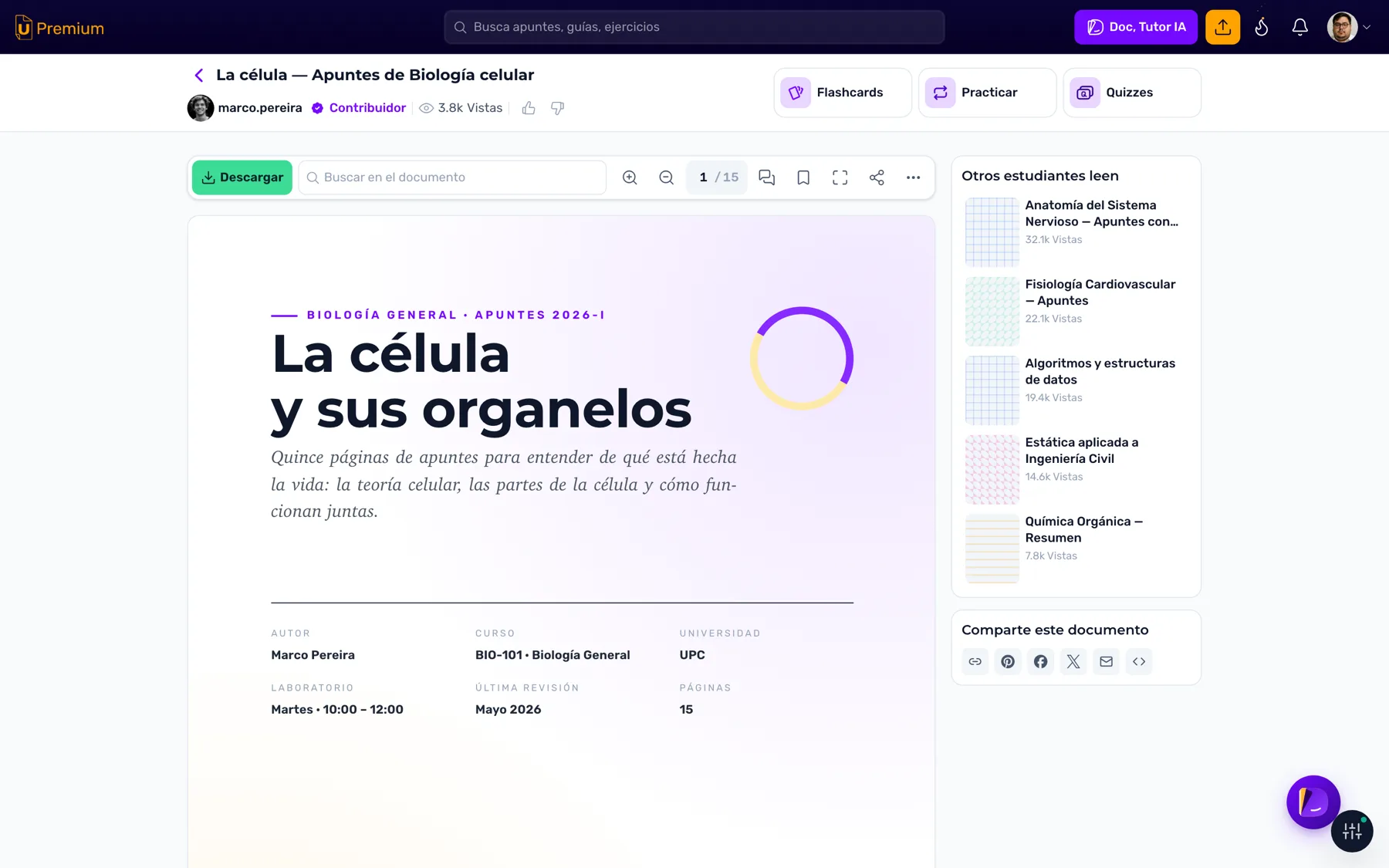
From any document, three study tools can be generated. They're full-screen experiences (the document disappears, the studying remains) and they share shell, sound, speech synthesis and the results chart. Three different products made of the same pieces.
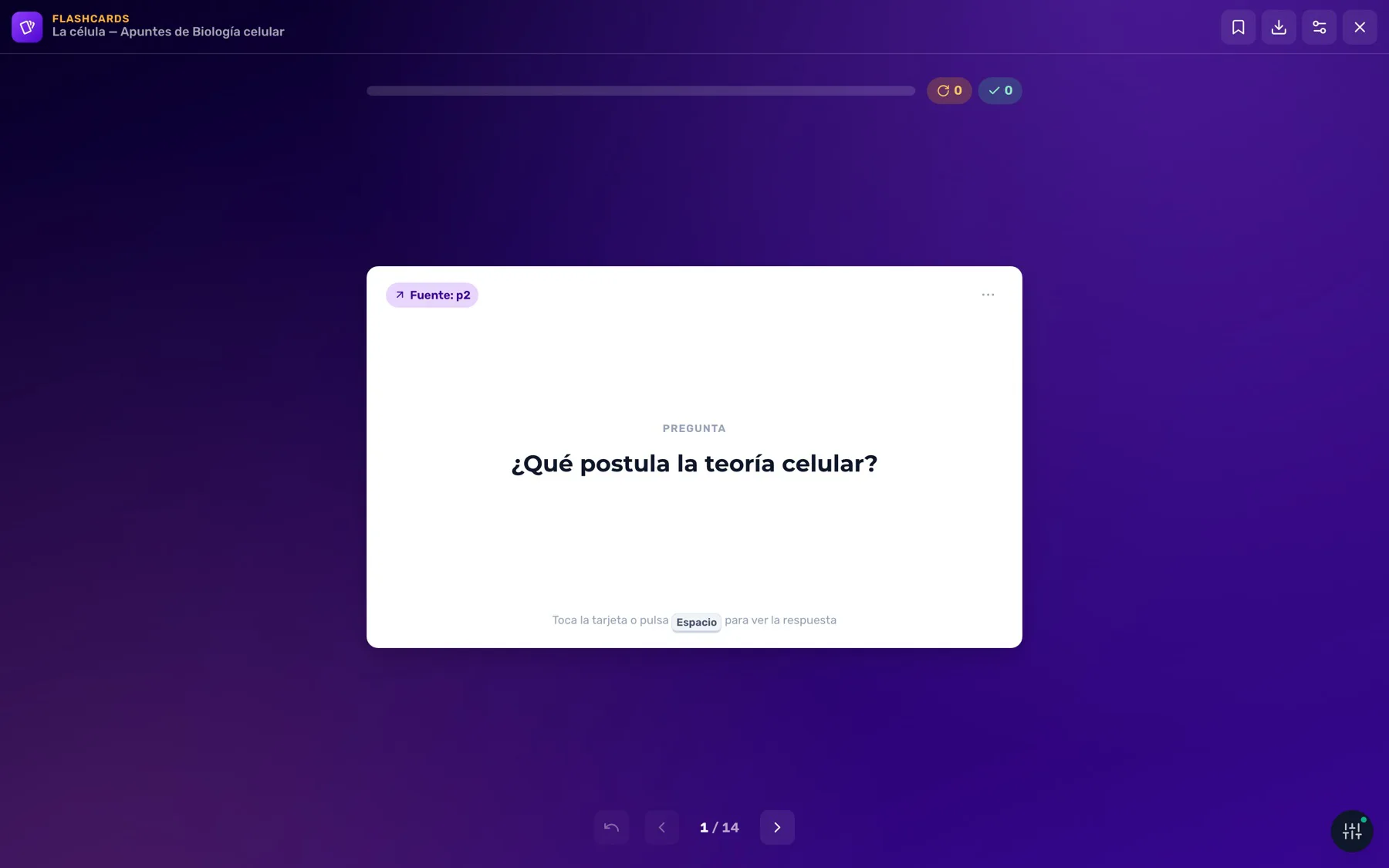
- Flashcards — memorize. Card and back in an immersive experience; the free and the premium versions are told apart at a glance by their palette.
- Practice — drill. Questions grouped into rounds, with three types (true/false, multiple choice, open) and adaptive difficulty: it goes up or holds depending on how you're doing.
- Quizzes — test yourself. Open questions graded by Doc, with natural-language feedback instead of a dry score.
And on top of all three, Review: a daily spaced repetition session, the technique of coming back to a topic right when you're about to forget it. Each well-timed encounter fixes memory better than rereading ten times in a row. The session doesn't come out of one document: it crosses everything you studied that week and builds the questions from the topics you got wrong most.
Freemium: what's free in each module, and where the wall is.
The free version isn't the premium one with padlocks on top. Every study module (reader, flashcards, practice, quizzes, review) got its own designed free tier, with its own palette, limits and conversion scenes.
- The reader guarantees a floor of complete pages and shows the rest blurred but scrollable. You can keep going down and the counter keeps advancing, so you see how much is left without doing the math. The document gets appetizing, it isn't hidden.
- Practice gives away the full first round before inviting payment; quizzes, the first questions. Value is always tasted before the wall.
- Advertising has a per-view budget: how many ads go in and in which positions is defined by each screen's design, not by the space available.
The wall that was there before created a perception problem: both doors were offered at the same weight. Users who believed they were paying for a single document were buying a subscription. I redesigned the sequence: the hierarchy stopped competing with itself. Checkout resolves in a modal over the document itself, with plan, methods and price on a single screen. Read, hit the wall, pay and keep reading: one single place.
The other door doesn't cost money: a points economy where uploading a document earns the points it costs to unlock another one. The catalog feeds on the same incentive that monetizes, and whoever can't pay, contributes.
When design lives in a repository, the way of working gets redesigned too.
With design in a repository and no longer in Figma, something more than the tool changed: how we collaborate changed. Versioning, branches, reviews: everyday ground for engineering, new for most designers. We're building the working framework for that context, and it iterates with every piece that comes in.
One of its first answers is the self-contained wireframe kit: a template with the system's styles, a session-state switcher and an integrated spec drawer. Any designer can produce without touching the repository, and enters the versioning flow at their own pace. The integration rule is a single one: no spec, no wireframe integration.
The other piece of the framework is the dev panel: a floating panel that lives on every page of the prototype. It lets you walk through user stories, tiers and breakpoints without reloading or opening DevTools. It's contextual, its controls change depending on where you are: home offers its scenes, the reader its access states, each tool its own. And it reads the capability matrix to show only the current view's rules. Whoever reviews sees every possible variation from the screen they're standing on.
All the work is documented to the same standard: more than a hundred documents and numbered architecture decisions. And a non-negotiable responsive rule: every view is verified at three screen sizes, with evidence.
The real prototype, view by view.
The demos above are reconstructions built to tell the design. This is the prototype exactly as it runs today, with synthetic data. Click to open large.